We need to graph a “Paired Comparison” and could use some recommendations on best practices for this.
Scenario:
- A “User” must compare 2 items against each other and choose 1.
- When making the choice the user must enter a rating: Was this a easy, medium or difficult choice to make.
- The user will enter a short explanation describing why he/she made the choice.
Current design:
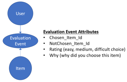
The data for the 3 bullets above will be in a vertex called “Evaluation Event”
The screenshot below shows how we have mapped this out.

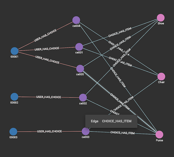
If there is a total of 6 items to compare, there will be 10 comparison events.
And the graph would look something like this.

There is a vertex between Item and EvaluationEvent called “Item2EvaluationEvent” where the source vertex is “Item” and the target vertex is “EvaluationEvent”.
In addition to this, we’re writing the IDs of the Items to the attributes “Chosen_Item_Id” and “NotChosen_Item_Id”.
Is this good graph design and is there a better way to do this?
Thanks.
